Rob Young's AS Media Studies Blog
This is where I will blog about the things I have been doing in my AS Media studies and I will write all the things that I think are nessecary here.
Tuesday, May 10, 2011
Monday, May 9, 2011
Evaluation
 I knew I had to base the elements my group chose based on my audience research. The most important questions we asked our audience were "What is your favourate sub-genre of thriller?", "What is your favourate aspect of the thriller genre?" and information about the audience's age in years.
We knew that to be successful, we had to create a thriller that would suit the most popular categories whilst not forgetting the ones with less votes.
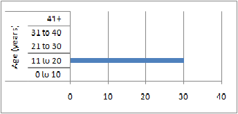
When the audience watched our thriller, we thought that it was important for them to feel intimited by what they were witnessing and therefore it satisifies their requirements for an ideal thriller
film. For full audience feedback as to what they thought of my thriller film please visit Section 11: Audience
feedback.
What kind of media institution might distribute your product and why?
I believe that in an ever changing w
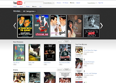 orld, new methods of technology are increasingly being used to allow small low budget films to be profitable. One method of doing this is by using advertising supported content on video sharing websites such as YouTube. The majority of users who use YouTube fit into our college student target audience, and therefore it is appropriate to use this website in such a form. Our target audience often find themselves struggling for money, so they can watch the film without paying a penny and the creators can still bring a revenue. However, this is not a long term solution, and income from this can be relatively small after a long period of time.
Personally, I do not believe that our film is aimed at an Art House cinema. Our film takes too many inspirations from other thriller films as mentioned furthermore into my blog. Therefore, it would be much better solution for my film to be on in a mainstream cinema. My work compares to a professional film with some similarities. One of those being that we used Adobe Premier Pro to edit our work, a program which is used professionally throughout the media to create many films. However, due to the fact we were only able to use one camera, the quality of our film decreases significantly because some parts have to be re-filmed from different angles.
Filming My Thriller (Diary)
After discussing the sub-genres of thriller with my group, we now had enough ideas of how to film our own opening scene. We knew that we had to remember the dark merky colours on camera as I saw in se7en and the quiet sounds from 'Silience of the Lambs'. Our group found some actors and a location which was set inside and outside my group member Tom Jennings' house.
December 21st 2010
Our filming began on this date. We had the idea of a girl walking home and is followed by two hooded men in the darkness. We only had one camera to film our work with, so many of our shots had to be filmed more than once so we could edit the footage to make it look like there were more cameras being used. The camera we used was not the camera offered to us by my college. My group heard from Warrington Borough Council that they had some better cameras which we could get hold of to film our work. We wanted to begin filming at night time so that the colour on our camera shots could be much more atmospheric. We were very limited in terms of what lighting we could use in our shots. When filming, the only lighting we deliberatly used to change the colours on screen was from a motorbike shining it's lights towards the set and the car in the film which beeps the horn at the girl.
January 4th 2011
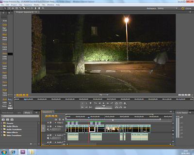
Today we began editing our footage with a clearer idea of how the final film will look once it has been edited. The footage we had without being cropped during the editing process would have been too long per scene and would have looked untidy. We managed to crop the film so it looked like we had more than one camera being used at once. There are many times throughout the film where you will see the camera switch from one side of the room to another. This is to allow the audience to gain a differant character prospective of what is happening in the scene.
We did, however encounter one problem with our footage which we will need to refilm. We took two shots of the girl walking around the same corner, both from differant angles. The problem we have which we did not notice at the time was that she took too much of a sharp turn around the street corner on the first shot whereas on the second shot it was much more of a turn at the edge of the pavement. These problems could not edited so that her turn around the corner looks smooth. Another part of our footage which we will need to refilm is the girl entering her house through her door and leaving the key inside the lock. This is crucial because it explains to the viewers how the two men managed to enter her house. This was the last shot that we wanted to film but unfortunatly our camera ran out of power whilst recording. This was very disapointing to our group at the time but now the rest of the footage has been edited in we have left space for the remaining shots to be inserted into the timeline in the editing program. The image above is evidence of our editing.
January 14th 2011
Now we had finished cutting the clips, we could now begin our work with on editing sound. This was a very tricky task, particularly during the scene involving the girl crossing the road. This was because when we asked the driver of the car to beep his horn, he didn't do it in a long and consistant beep as we wanted him too. This was becuase his car didn't let him hold his horn for long periods. We knew we would have a hard time editing the horn so it would sound how we wanted it. In the end, we thought it was better for the horn just to beep when the girl stepped onto the road. Among the other sounds which we had to cut out was the shout of "Action!" from the start of our scenes.
January 19th 2011
The only short processes we had left to add to our opening scene was to add music, the opening titles and decide on a name for the thriller. I remembered that it was important to consider which font I used in the opening credits and how they appear o
 nto the screen. We chose the white text because it stood out best when our scenes mostly have a dark background. We also thought it was best that the text should slowly fade in and out of the screen. When my name appears on screen, it was originally supposed to appear on the bottom right rather than the left. I soon decided that it would be better my name to appear in the bottom left corner because it is the direction in which the girl was walking in the scene. If it had been put in the bottom right, this may have been annoying for the audience's eyes because the girl would have been moving away from the text.
When it came to chosing our music, we thought that something with high notes from a piano would help set the atmosphere. The song we chose was from the opening 20 seconds of 'Swansong for a Raven' by Maralyn Manson. This worked brilliantly when the girl is walking down the lonely road, combined with the white text for the opening credits.
I thought of the name 'Abduction' because it links in with the plot and what is going to happen in the opening scene. We also had the idea of calling it 'Incention' or 'Ascention', but we all felt that these titles didn't link in well enough with the plot. Another idea for the film was 'Kidnap' or 'The Kidnap', but we felt that this wasn't a very original name and we needed something a little differant.
Thursday, April 21, 2011
Wednesday, April 20, 2011
SECTION 2: RESEARCH INTO EXAMPLES OF COMPARITABLE PRODUCTS: American Psycho
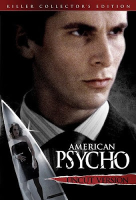
American Psycho was the next thriller film which I watched. The opening titles of the thriller film show red liquid dropping to the floor in a side on close up shot. In time with the shot of the blood dropping is a short orchestrial sound. This makes the viewer feel like they are witnessing blood dripping from a dead body. They also assume this because the film they are watching is called American Psycho. The white background makes these red droplets look very visable. Since red can often represent anger, when falling to the bottom of a white backround it may make a viewer feel slightly distressed.
We then see the droplets fall onto well prepaired food in a posh and very up market New York restaurant. We see the restaurant full, with the camera focusing on four young profesionals. They are talking to each other, happily.
We then see the droplets fall onto well prepaired food in a posh and very up market New York restaurant. We see the restaurant full, with the camera focusing on four young profesionals. They are talking to each other, happily.
Once they leave the restaurant we see the first use of darker colouring in the film. This is outside of a nightclub. The film's title's are similar to other thrillers in that the bold white colours stand out in a darker background and are ment to be powerful for the audience to witness. When female dancers in the nightclub point guns around, this makes the atomosphere much more tense to the audience.
Monday, April 18, 2011
SECTION 2: RESEARCH INTO EXAMPLES OF COMPARITABLE PRODUCTS: Unthinkable
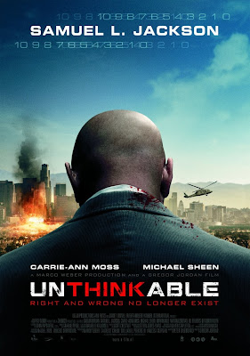
The very first thing we see when we watch the film "Unthinkable" is a nervous man standing in a dirty and cream coloured room talking to a camera. The shot is edited so that the sound and picture quality is similar to that of a small handycam. In one of the clips, he says that his name is Steven Arthur Younger. He then changes his name to Yusef Artum Mohammed, which imediatly tells the audience that he is a musilm and that the way he is filming himself may suggest to the audience he is recording a suicide video. It is important to mention that he is stood in an empty room, and that because of the cream colour and camera quality it carries on with the convention of a thriller often not using many bright colours in a situation of danger and threat.
A black screen then appeared with silver writing for the opening credits. The text fades in and out, reminding me of the powerful text I saw in the credits in 'Silience of the Lambs'. Although the text enters the screen slightly differant in that film, it does have a similar effect to the audience. When the words 'Unthinkable' appear on the screen, they move towards you as the font becomes larger in the centre of the screen. This suggests that something awful is about to happen during the course of the film and it wants the audience to become fearful early on and wants to maintain this throughout the thriller. This is similar to 'Jaws' because it wants the audience to become scared of the giant shark until the end. In this film, the man in the cream room is the shark.
The film then cuts to people walking across busy streets in New York. They are wanted to be seen as every day people getting on with their lives. On screen silver text appears saying the word "Tuesday", which was similar to seven, in that in wants to tell the audience that events of film are going to happen over a few days. A woman is seen smiling at a child. The camera shows that she is wearing New York Police Department uniform with a gun under her jacket. This continues the convention of having a dangerous object in a peaceful area. The next scene shows the headquaters of the police department. The room has a mixture of gloomy colours with brighter shades, although it is important to remember that since the location is a work place, it wants to show that the police are hard working. The camera then shows a man holding black and white photographs of two witnesses. Again, this is another link to the merky colours found in many thrillers.
The film then shows the witnesses in their living room. The television is switch on, showing the news. It is talking about a shooting. Note the red bold colour fade on the television. This tells the audience that the man involved is a threat and tries to make them think that even if his character was a real person, they should not go near him.
Sunday, April 17, 2011
SECTION 2: RESEARCH INTO EXAMPLES OF COMPARITABLE PRODUCTS: Brooklyn Rules
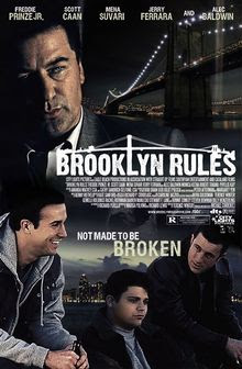
'Brooklyn Rules' is an action thriller, with the first 5 minutes of the film set in 1972. The film begins with a black screen and church bells can be heard in the background. There is an echo of a priest speaking to the congregation. The opening shot is of a colourful statue Jesus Christ. The next scene is of a much more cloudy evening shot of the brooklyn bridge. The shots at the bridge are ment to show crime, whilst the church is of harmony. As the film switches between the two, it creates a comparison asking the audience where would they prefer to be?
Another give away of the location is the New York accent. This is where many thrillers are set, including 'Unthinkable' and 'Se7en'. We see plenty of disturbances of the hamony in the opening scenes of 'Brooklyn Rules'. The first is when a child steals from a catholic church, the second is when a man is found dead sat in a car. He has a bullet wound on his forehead. The disturbance of peace here is that he is sound in a lush and green forest. In the back of the car is a puppy trapped in a box. This is a warning of suffering for what will happen later on in the film.
Another give away of the location is the New York accent. This is where many thrillers are set, including 'Unthinkable' and 'Se7en'. We see plenty of disturbances of the hamony in the opening scenes of 'Brooklyn Rules'. The first is when a child steals from a catholic church, the second is when a man is found dead sat in a car. He has a bullet wound on his forehead. The disturbance of peace here is that he is sound in a lush and green forest. In the back of the car is a puppy trapped in a box. This is a warning of suffering for what will happen later on in the film.
Subscribe to:
Comments (Atom)
